Design Development Brief
After interviewing two experts with experience in design for people with blindness and two people with blindness, we created two personas who we felt represented our users.
Personas:
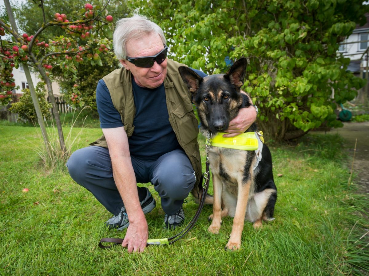
Dog Lover Dave:
- ~60 years old
- Been blind for ~30 years
- Has a seeing eye dog
- Wishes people would leave Kevin alone while working
- Walks fast, trusts Kevin to keep him safe
- Dog is more fluid than cane, less stop and go
- Likes the confidence and speed that Kevin lends him
- Prefers not to have to ask for help, but still does when not with Kevin
- Finds sitters for Kevin while flying
- Uses a cane when without Kevin, in unfamiliar settings
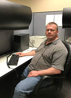
Hasty Harold:
- ~40 years old
- Wants to get where he’s going fast - he’s got deadlines to meet
- A dog would be too much hassle
- Thought about getting one, but decided not too
- Likes to be prepared for a journey, and gets frustrated when his plan goes awry
- Hates when the red line is down and he has to improvise his commute
- Uses a cane
- Asks around for help when lost
- Doesn’t have time to fiddle around with his phone when lost
- Gets annoyed when there are things above cane level that he walks into
Our users and experts all expressed rampant frustration about the speed and confidence with which travelers and commuters with blindness can navigate a subway station, so both of our personas have places they need to be and are on a schedule.
The most important distinction we identified among people with blindness was a split in what assistive technology they primarily relied on: some used a cane, and others used a seeing eye dog. Often one person would use a dog for part of their life, but then the dog would die and they would not get another one. Even when they had a dog, they might not want to bring it with them on a plane, and would sometimes end up without it. To capture this, one of our personas has a dog and the other does not.
The biggest pain point for dog users like Dave was people trying to pet or play with their dog while it was working, and this was part of the reason someone would not get a new dog after their first one died. An intervention in this space would be mostly targeted at sighted people, so we wanted to focus on cane users so that we would be designing for our user group. Moreover, dog users already felt fast and confident walking in the subway, so we felt that we could have more impact making something for cane users.
Cane users like Harold felt nervous, slow, and frustrated tapping along in the subway station, searching for the right stairs to the right platform while dreading the sudden feeling of empty space under their cane which would signal a close encounter with the edge of a platform. We saw this frustration first hand during a visit to Park Street station, where a visibly angry cane user found himself walking back and forth in circles looking for the right staircase.
We created a list of potential designs to increase the speed and confidence with which people with blindness could navigate the, then sketched the most promising ideas from that session.
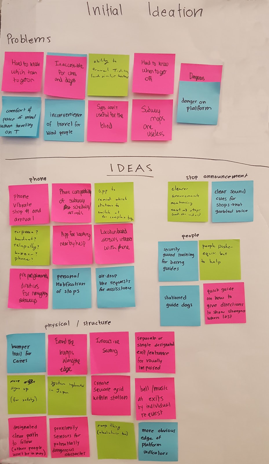
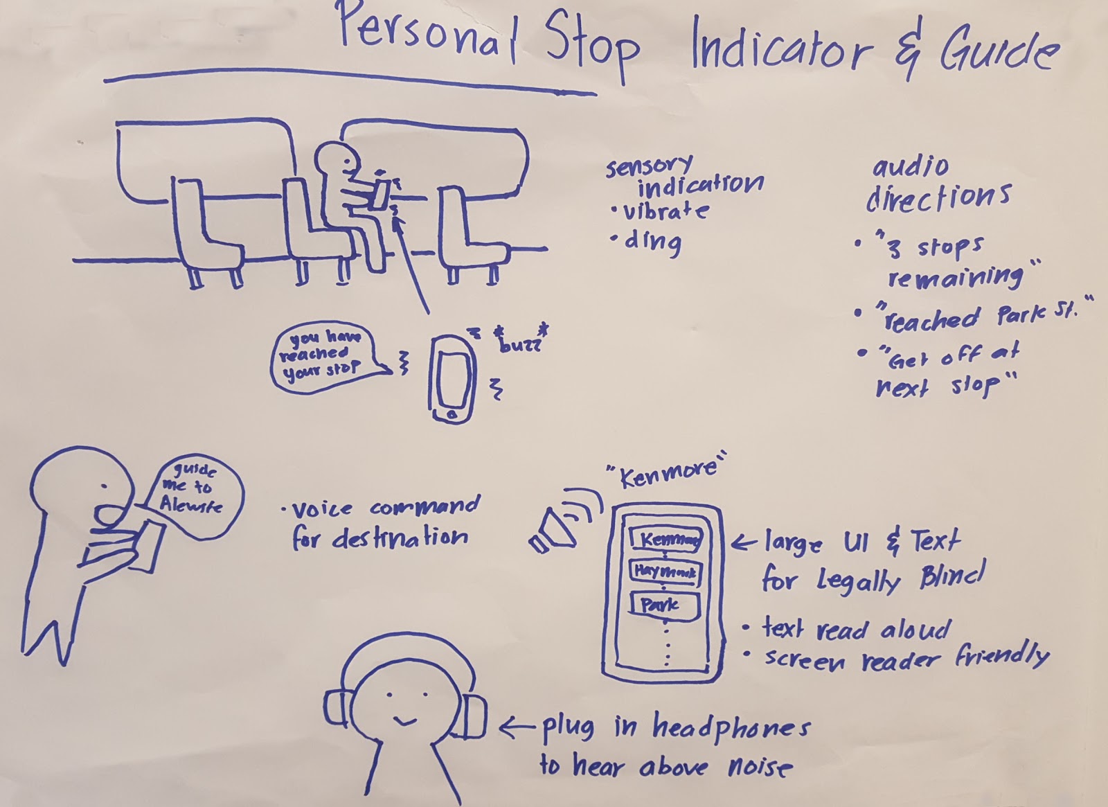
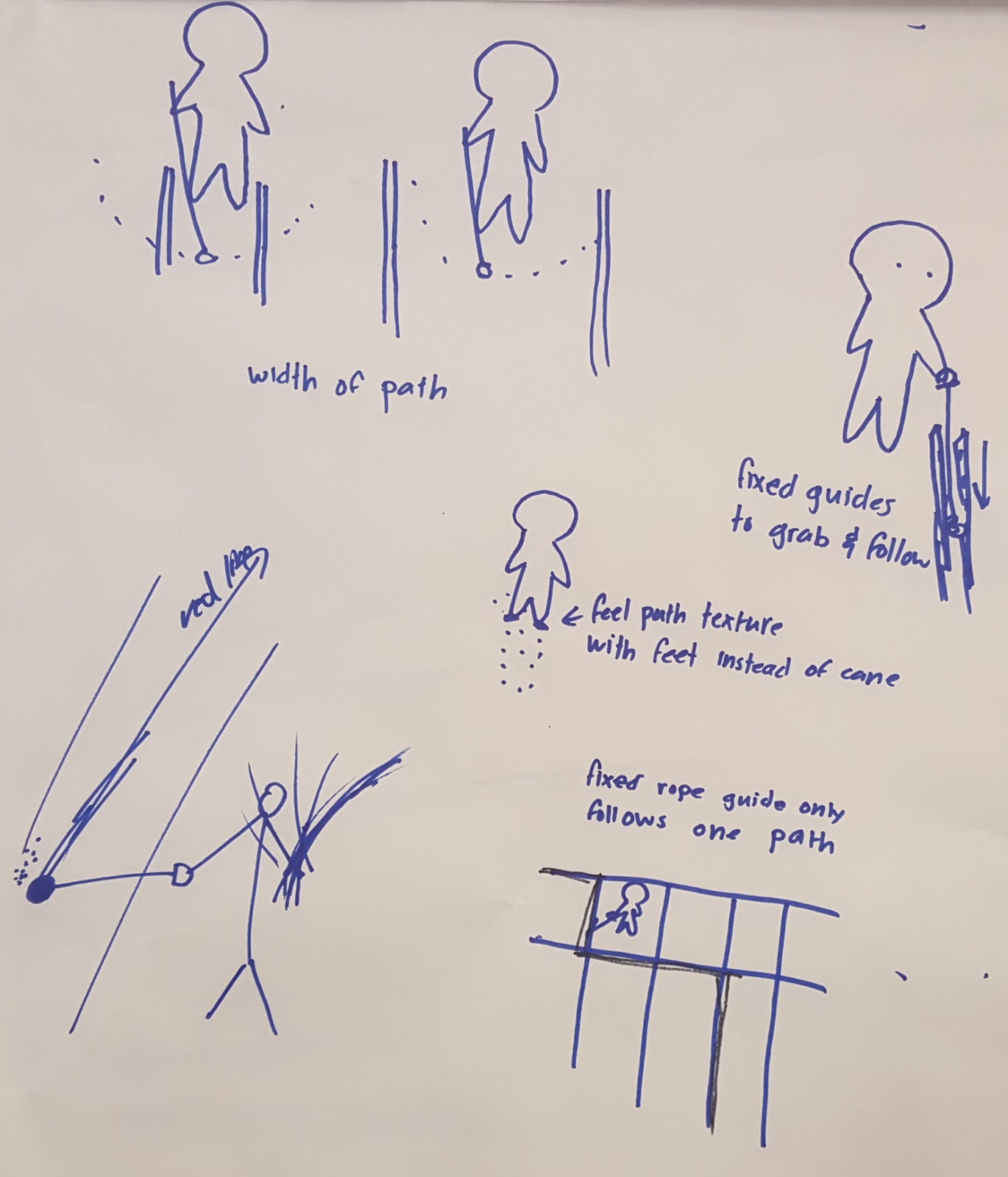
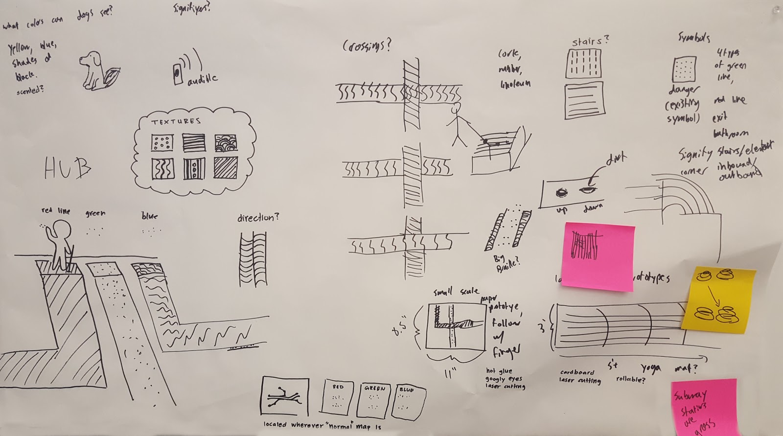
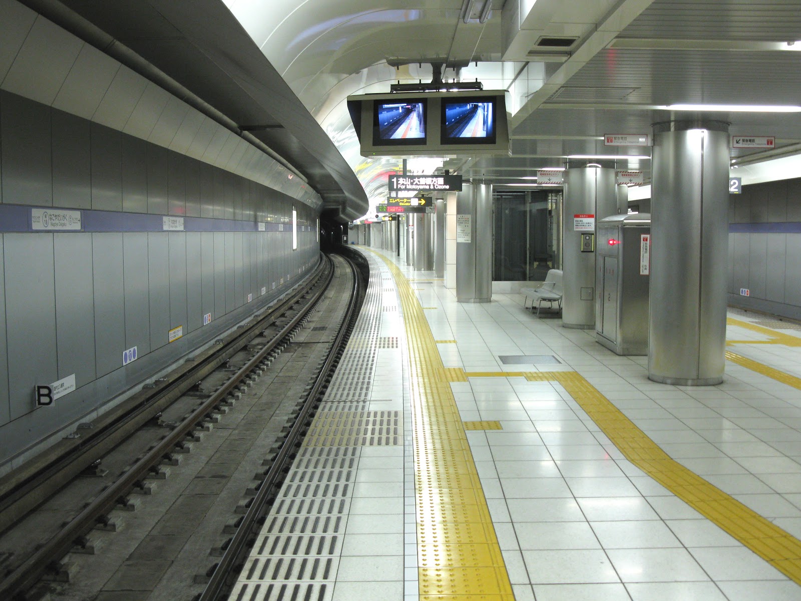
From these ideas, we wanted to stick with a low tech solution that would be accessible to the greatest number of people and not waste their time fiddling with their phone. The floor path has the advantage of not needing to touch anything in a dirty subway station, and is easier to make accessible to both left and right handed people while still letting them use their cane in the way that they are accustomed. It has also been tested already in a much simpler form in subway stations in Japan.
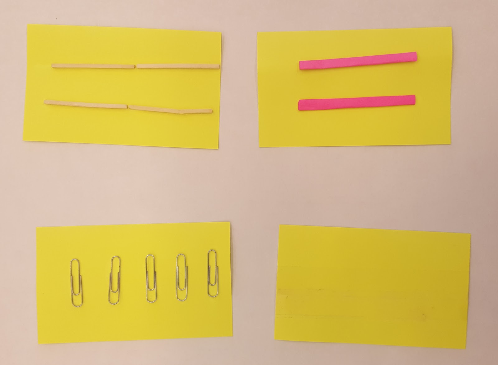
We tested all these ideas with one of our users using paper prototypes.
We also mapped out how the floor path system would work in a storyboard.
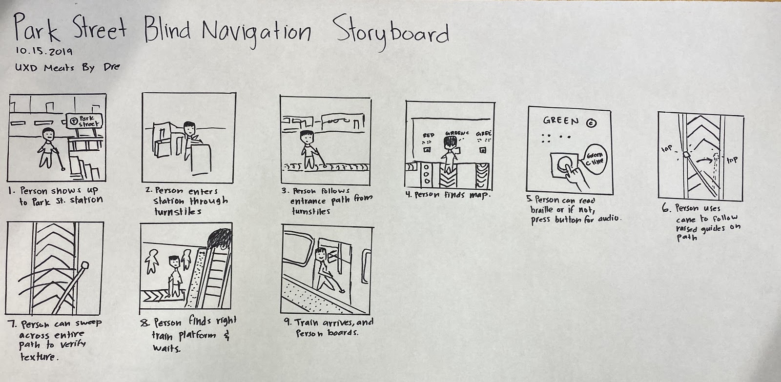
The story starts with a cane user arriving at Park Street station, and immediately encountering a path to a hub from which all the other paths emanate, labeled in braille. We learned from research that fewer than one in ten people with blindness can read braille, so there there is also a button they can feel and press to have the name of the track spoken allowed. Once they have found the right track, they follow it to their platform by using their cane as they normally would. Along the way, they must also be able to use their cane for its normal use: feeling for obstacles, walls, staircases, and people, which requires a tapping, sweeping motion. We accommodate that motion with larger raised edges on the track, so they can feel mostly for the edges of the track with the standard tapping and sweeping motion. This way, they can follow the track without losing their ability to scan for obstacles. If they want confirmation that they are still on the same track they started on, they can drag their cane across the path to verify that it has the same unique texture that signifies which track they are following.
We learned from our users that the best contingency for getting lost or off track is to just ask for help. With a path nearby, a user can ask to be directed back to the nearest path, then verify if it is correct by dragging their cane across the path.
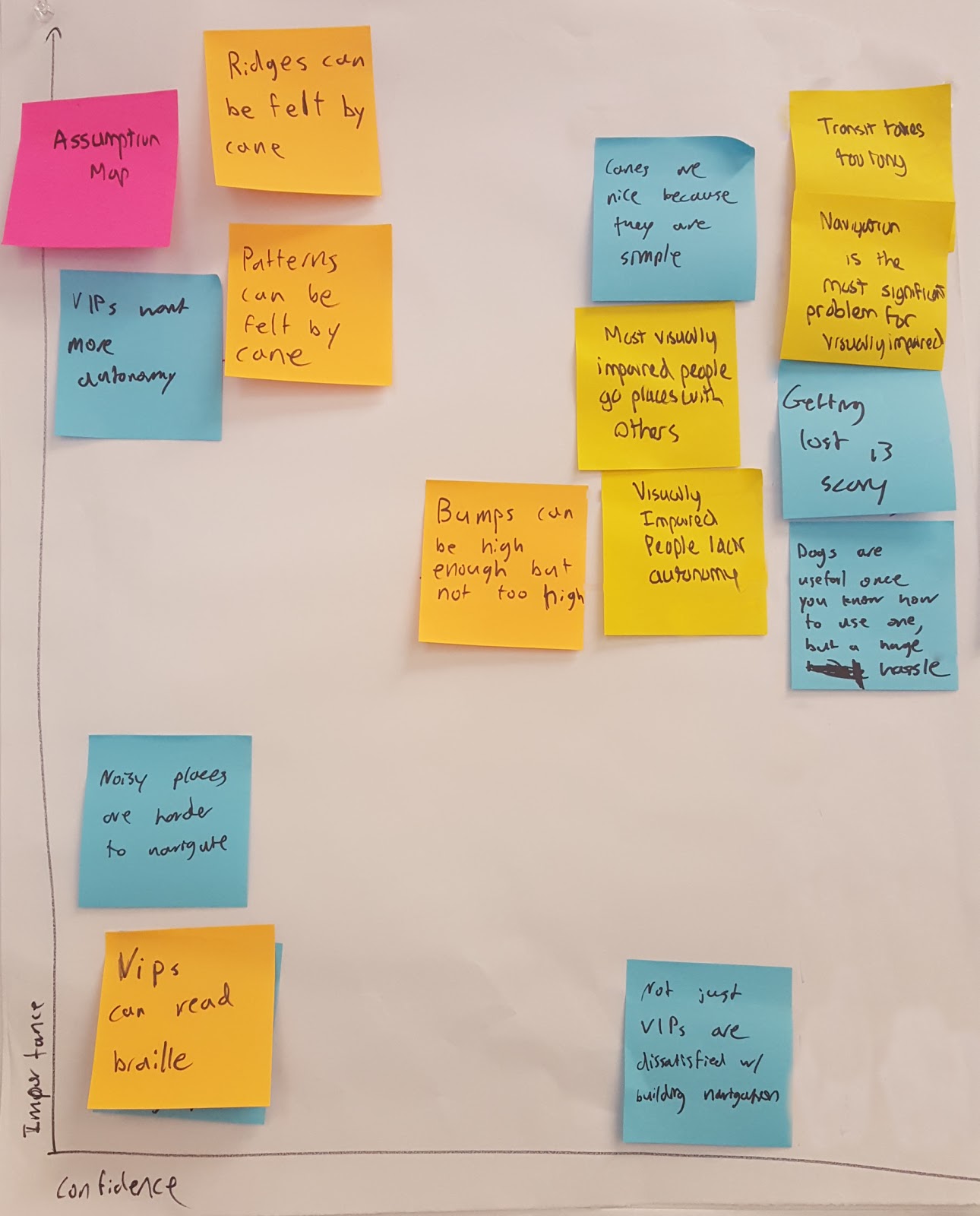
We also mapped our assumptions that would be important for this design and its impacts. We need to make sure that the ridges and patterns can be made high enough to be felt without being high enough to trip on or to block wheelchairs.
We considered several other options which we realized would not work for one reason or another. Audible beacons would not work because subway stops are already extremely loud. A magnetic tip in the cane would not work because it would collect all kinds of metallic gunk over the course of a day. Engraved guides in the floor would fill up with dirt and become undetectable.
Unfortunately, we were not able to conduct a usability test due to extremely inclement weather and unsafe conditions. This is definitely a limitation of our design development, and one we will be addressing as soon as possible. We need to assess how possible it is to follow a track while still using the cane to avoid obstacles at different path widths and which patterns can be distinguished by dragging a cane across them. We also need to test if different floor materials can be distinguished as a path, and if the hub can be understood with a button or with braille. For our other ideas, we will perform a usability test using a script for the personal stop indicator, and we will test the handle track by putting a string on our handle prototype and having a facilitator act as the track on the other end of the string. Having been stifled in our attempt to perform a usability test by an act of God, we now have time to make some full scale paper prototypes, which will be more useful for testing than the small scale ones we currently have.
For the personal stop indicator we will use this script to simulate the voice interaction:
Beginning prompt
- Would you like to: Run tutorial, start your trip, or change your settings?
Tutorial
- This is what two stops remaining will feel like: buzz buzz
- This is what one stop or one minute remaining will feel like buzz
- This is what your train arriving and boarding will feel like buzzzzz buzzzz
- This is what arriving at your destination will feel like buzzzzzzzzz
Go on a trip
- Please state your destination: __
- Please confirm that your destination is: __ (Y/N)
- Directions to _____.
- Turn left to platform/The platform is on you left (You will need to go down a flight of stairs?)
- The train will arrive in 1 minute.
- The train has arrived and is boarding. – buzzzzzzz buzzzzz –
- – board train –
- The trip is expected to last 15 minutes.
- Two stops remaining. – buzz – –buzz–
- One stop remaining. – buzz –
- You will arrive at your destination in one minute. – buzz –
- You have arrived at your destination. – buzzzzzzzzz –
- Exit doors will be on the right.
Preference settings
- How soon do you want to be notified of upcoming stop? (1 stop ahead, 2 stops) or time (5 minutes before, 2 minutes before)
- Audio or vibration notifications or both?
