Design Refinement Brief
Our Design: Before
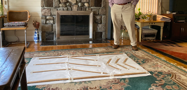
In our previous phase, our primary idea was to create a physical paths in park street station that would allow people who are blind to navigate Park Street station. We imagined that they would be able to follow the patterns on the ground using their canes, however we were unable to conduct a usability test during that phase. At the beginning of this phase, our first priority was to put our ideas in front of a person, so we conducted a user interview that gave us a lot of valuable insights that informed how we would change our design moving forward.
Key User Interview
We met with a user who had experience with both a seeing eye dog and a cane and presented our paper prototype to him. When we described our idea, he immediately brought up concerns about it’s implementation in the United States. Essentially, he said all of our ideas would be impossible for a number of reasons such as the cost to change the infrastructure and the lack of prioritization of accessibility for the visually impaired in the U.S.
For example, he brought up the Tactile Ground Surface Indicators in Japan in which people who are blind could lock their canes into the track and follow it along, moving as fast as people with seeing eye dogs could. He explained that because Japanese culture values society over the individual and spend resources maintain clean and effective infrastructure, solutions like these that are highly effective in Japan would not be as successful in the United States. We hadn’t considered these cultural and societal values as important to the efficacy of our design before, so this conversation was incredibly insightful.
He also shot down our other ideas that would address problems that we thought existed but actually didn’t, such as keeping track of which stop to get off at. He said he counts how many times the door opens instead of how many times the train stops, and the law requires that the stops be clearly announced.
In the end, he strongly suggested that we pursue ideas that didn’t involve changing the physical space of the station, and with that in mind, we decided to pivot away from our original idea.
Secondary Ideation and Design Decisions
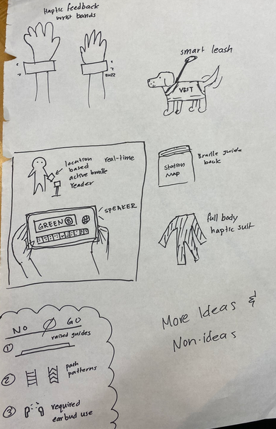
After debriefing our interview, we decided to come up with more ideas. We wanted to be more open to ideas that incorporated technology in a more involved way than our previous ideas did. Based on the feedback from our interview, we also had other key requirements for these new ideas:
- People should be able to use their hands freely (for cane or dog or coffee).
- Ideas should definitely address the problem of navigating the station, not identifying stops.
- Designs should not attempt to make navigation simpler at the cost of choice and autonomy (One path to follow that is longer or only using limited set of exits or stairwells).
- Designs should not solely rely on sound because stations are very noisy.
With these in mind, we decided to pursue the idea of an app with accompanying haptic feedback wristbands that would indicate the direction you would need to go in.
Our Design: After
Our current design uses vibrations in two wristbands to provide information through haptic feedback. Direction would be communicated with the corresponding wristband: if you need to make a left turn, your right wrist band will vibrate. To indicate where you want to go, you would interact with a mobile app interface and use swipe gestures to specify which line you want to take and whether or not you intend to go outbound or inbound.
This new design satisfies the same needs as our previous ideas as well as improves on their shortcomings or failures. It would be easier to implement because it doesn’t involve installing any physical structures, so it would provide a solution sooner rather than later. Additionally, unlike our ideas that involve grabbing a handle to follow, this one is generally hands free, which is something that our users value. The navigation itself doesn’t rely on audio, only choosing the destination, so it would be just as effective as our other physical solutions in that regard. Another issue with navigation solutions for stations is that the environment is constantly changing, and this was something our physical implementations could not accommodate. Since updating software is easier to do than making modifications to the station itself, our new idea is more flexible and reliable. Changes to the directions could be made immediately rather than over the course of days or weeks. From a cultural perspective, this idea doesn’t rely on others maintaining the space or keeping areas particularly clean, and provides more autonomy for individuals, which is generally very valuable for people in the United States. People who want a solution immediately could get one rather than depending on governing bodies to fund infrastructural developments.
Physically speaking, the device is small and unobtrusive, which were other characteristics that were important for our users based on our interviews. It has a digital interface, and our research has shown that most people who are blind or visually impaired are very familiar with using smartphones on a daily basis to carry out day to day tasks. Unlike our old idea, the users wouldn’t have to learn anything new like specific floor patterns denoting different T lines. Feedback from our paper prototype also informed us that people wouldn’t spend time verifying the patterns on the floor because they would be more focused on moving and not colliding with anything.
We decided to focus on feasibility as one of our priorities for our team because we wanted to be able to produce a wireframe and also because it seemed more important to our users than something more blue sky. We had to trade off some creativity and innovation for the sake of practicality, but ultimately we believe our new idea is still more effective than our previous one.
Developing the Wireframe
We made our wireframe in python using the pygame library. We chose pygame because it was extensible enough to play audio while still being fairly quick for prototyping. We had people on the team who were already reasonably comfortable with pygame. The wireframe captured the basic functions of choosing your desired green line through swiping and receiving audio instructions.
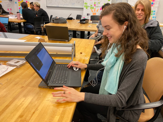
The instructions for using our wireframe were as follows:
You are blind and attempting to navigate the Park Street subway station. You wish to take the Green D line outbound.
Additional instructions: Since you cannot actually walk around you need to use the arrow keys to move instead. The left and right arrows rotate, while the forward and back arrows move forwards and backwards. With your eyes closed, turn towards the beeping and move in that direction.
Dependencies: The wireframe requires pygame, numpy, and gTTS from pip3 and you need mpg123 installed from apt. The wireframe needs to be run on Linux.
Setup: Run the following commands to install the dependencies:
pip install ______
pip3 install ______ sudo apt-get ______
To start the app run: `python3 test.p
Developing the Physical Prototype
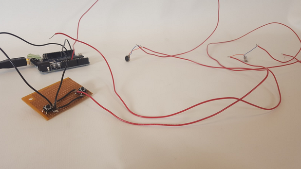
Although we initially relied on an audio only software prototype for the heuristic evaluation, we also built a physical haptic feedback prototype using vibrating mini motor discs (similar to the motors used for phone vibration. The motor peripherals interface with buttons that trigger vibration. The use of two buttons allows us to manually dictate the required direction by controlling each motor separately. The buttons and motors are connected to an arduino, which is used exclusively for ground and 5 volts. The motors, as seen in the photo below, are fastened to the bottom of the wrists using an elastic sleeve that fits around the forearms of the user.
Heuristic Evaluation Feedback Reflection
We had Team Prongles test our wireframe and provide heuristic feedback. The most important issues were centered around visibility in terms of getting feedback and validation during use of the app as well as user control and freedom. In the future we would want to have clear ways of exiting the app, the ability to specify destination and other commands with voice, and provide more information in general during its use.
They told us that currently the way to choose the lines through swiping isn’t efficient because you have to go through multiple items before finding the one you want, so to address that we could just allow them to say what their destination is. They described how they had a hard time knowing if they were doing the right thing or the wrong thing, so we would want to give some confirmation that the app detected you successfully made the right turn. Similarly, we would want to implement notifications for if you went the wrong way, are about to take a dangerous step, or if the app itself is not functioning properly. We also haven’t included any indication of having successfully reached the destination, so we would add that as well.
There were some other possible features we could include, such as being able to learn the user’s specific gait and speed to be able to give more proactive instructions. We could potentially allow people who have a familiar path that they usually follow in the station to be able to input that path into the app. These customization and personalization features would make the navigation process less stressful and confusing, but they aren’t as high priority as the other heuristic issues that were brought up.
Limitations
Progress this phase was limited by the kinds of users we had access to as well as the type of prototype we were able to provide our users. In an ideal world, we would have taken the time to review iterations of our design with blind users of public transportation to completely validate the wireframe design. However, given the fast pace of this phase, we only had time to review our interactive wireframe with other students in user experience design. Also, our intended design relies on haptic feedback from vibration motors attached to the users wrists. However, we were unable to produce a working prototype quickly enough to include haptic feedback in this round of heuristic review. Instead, we simulated the experience using sounds and included a note about the differences between this simulation and the real experience.
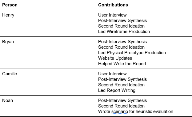
Effort Chart
